Thursday, January 26, 2017

The Basics and CRAP

A cute, little handwritten sign I saw when I went storm chasing at the end of last spring.
I'm not sure why I took a picture of it. I would have missed it, but it caught my eye.
This photo was taken just outside of Laverne, Oklahoma. Photo by Wyatt Stanford

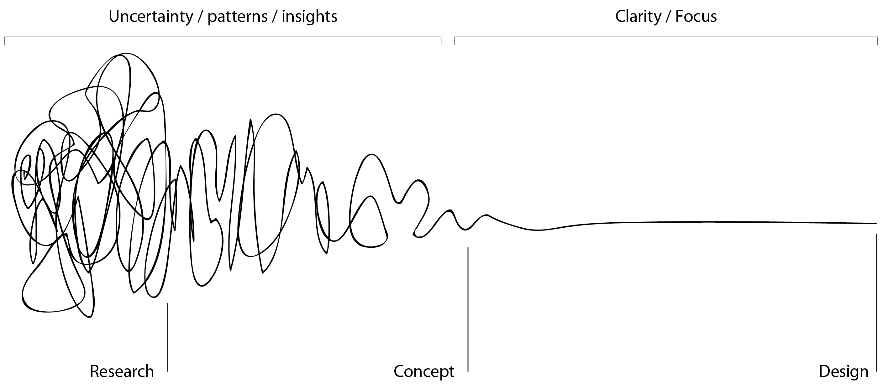
Last week in my PR publications class, we discussed the creative process and all the thought and effort that goes into design or anything creative for that matter. 

This week, we looked at the basics of design and typography, which we must know to create an aesthetically-pleasing piece that communicates a message at the same time.

Tuesday was all about the design values and design principals. The basic design values that give pieces a pleasing look are simplicity, minimalism, clarity and unclutteredness. Simplicity relates to something not being overdesigned, which can happen often for new designers. I remember my first piece I ever graphically designed for my graphic arts course at Eastern Oklahoma State College. It was an infographic with a map of southeastern Oklahoma on it. I used like ten different fonts and varying weights on lines. My instructor said it was a nice try, but it was just too much. In addition, the piece violated the other design values. It was complex, using lots of color and space, throwing minimalism out the window. The copy was clear, but the background image I chose was pixelated and distracting, so the entire piece wasn't easy to read. The design itself seemed cluttered, like all of my elements were panicking in little claustrophobic spaces on the page. 
Thankfully, I learned my lesson and designed a better-looking typography poster for my second assignment. 

Next, we discussed leading the eye in a design. Basically, designing the way we read- left to right, top to bottom. 

Now for my favorite part. We talked CRAP. Yes, CRAP, which are the four basic design principles, contrast, repetition, alignment, and proximity.  

Contrast deals with making things different to enhance legibility and look. This can be with colors, like using a light color with a dark color, or fonts, bold with unbolded, one font family with another, etc. Repetition is consistency in a piece. It's necessary to keep consistency in a piece, especially in a PR publication, because it represents a brand. Repetition unifies and strengthens our pieces. Alignment is making sure things are lined up. Finally, proximity is space, closeness, etc. Information should be organized with proximity i.e. we don't want a paragraph detailing a topic far away from its headline. 

We wrapped things up with a discussion on how to achieve balance while telling a story, like using color and being bold or minimal in our designs and some basic techniques to make our designs pleasing to the eye. 


The 10 Commandments of Typography. Graphic by Designmatic. 
Thursday was all about typography. Interestingly enough, we started class with the history of language. Historical linguistics is a fascinating subject to me. Mental Floss contributor and Youtube Arika Okrent has done some amazing videos about the evolution of language and the origin of words. One of my favorite videos she has done deals exactly with the origin of language, or the theories of how our ancestors evolved to use language thousands of years ago. That was a red herring, but I think everyone should know about her channel on Youtube. Seriously. Look this channel up. It will rock your linguistic perceptions about the world. 

Back to PR Pubs. We couldn't have a PR Pubs class (or basically any modern technology for that matter) without our good friend Gutenberg and the printing press. Or our good friends who invented writing, the Romans...or the Greeks...or the Phonecians...or the Sumerians. Our alphabet has a complex past, to say the least. 

After about 25,000 years of world history, we meandered back to the present. Bad typography can detract from a piece. Readers can get so distracted by a bad font or arrangement of the type that they lose our message or stop reading entirely. 

Next, we looked at different terms, like typeface, character, uppercase, lowercase, etc. The main thing we wanted to get out of the course today was the difference between a serif font and a sans-serif font. Basically, this or this. Those little strokes that hang off the letters in a serif font are called serifs. Sans in French means "without." Hence, sans-serif, or without serif. I struggle with mixing serif and sans serif fonts. I liked looking at the font blending slideshow today because it gave me an idea of how to do just that. 

I also learned today what a pica is. Everytime I got on InDesign, my measurements are always set to picas. Now, I know it takes six picas to make one inch. I also learned what leading and kerning are. I literally have never seen those words in my life untile today. Leading is the space between lines of text. Kerning is the space between letters. The more you know.


Welcome, yall! Pencil fonts are popular.
Photo by Wyatt Stanford. 
We finished by learning more about type principles: legibility, similarity, alignment, uniformity, consistency, hierarchy, and contrast. I hope I can get a better grasp on the execution of my typography now.... 

For our homework, so to speak, we had to look at posters with typography to see what type/design principles were employed. I went to visit my Choctaw advisor in Copeland Hall today when I noticed her welcome sign. It's written in a pencil-looking font. Pencil fonts and brush fonts I have noticed have become very popular recently. Every poster I see uses this brushy, cursive font and I am dying to know what it is. I have seriously seen it everywhere, from menus, to billboards, to social media posts, etc. I cannot escape this font. 

After my meeting, I was walking down the stairs and noticed a flyer for student media hanging on a billboard. I noticed that the type was used for visual interest. The design featured a map of Oklahoma with the different aspects of student media in a wide number of fonts. The "reporting" is the most prominent word. From the word reporting, the eye is taken right to the other bolded words and then, finally, to the periphery of the desing. This demonstrates how
Flyer for Student Media.
Photo by Wyatt Stanford
contrast can held a design. The design I feel is fairly minimalist, making use of just two colors and varying fonts to show what one can do in student media. I like designs like this, especiallly with maps. After I learned the basics in my graphic design class, I sat down one day and made a typography poster of California, with each of the county names stretched to look like their respective county. I also began an Oklahoma version, but stopped because many counties in Oklahoma are squares or simple geometric shapes. I will figure out how to perfect it one day. 


This week was very insightful. I am excited to put my knowledge of design basics and typography to work in the future. 


Wednesday, January 25, 2017

Professional Portrait

Photo by Wyatt Stanford

My name is Wyatt Stanford. Everyone calls me Wyatt. 

I am from a small town in southeastern Oklahoma called Haileyville. If you don't know where that is, it's about 14 miles east of McAlester. There were 23 people in my graduating class. Even though I am living in Norman attending college, I still consider Haileyville, and to a greater extent, southeast Oklahoma home. I return home quite frequently to see family and friends and to do photography. 
One of my favorite photos I have taken. 
The night sky is my favorite subject. 
Photo by Wyatt Stanford


Right now, I am a junior. This year, I transferred to OU after earning my associate degree in mass communication from Eastern Oklahoma State College (Go Mountaineers!) in Wilburton, Oklahoma. 

What gets me jazzed up about public relations is the wide range of career paths in the field and the skills associated with it. I feel that my talents and interest line up really well with public relations, and I am so excited to carry that over into the career world. My dream is to work in tribal communications, communicating and advocating for Native Americans, especially my tribe, the Choctaw Nation of Oklahoma. 

My desire to learn and do my best motivate me. I have a strong work ethic, which I think relates back to wanting to give my 100 percent. I get much satisfaction from a job well-done. An added bonus would be somebody benefitting from my work. 

Writing is one of the principle my principal forms of expression. Along with photography, I feel that writing gives me a voice. I've always been told I should pursue a career in writing and I never thought that I would end up exactly that! Outside of journalistic/PR writing, I love to write for leisure. It's nice to create my own world to take myself out of the real one every now and then. 

Thursday, January 19, 2017

Beginning the Creative Journey

The design process illustrated. Picture from revisionlab.wordpress.com.
Today in my public relations publications class, we discussed the creative process and the quality of work to expect with each of our levels of experience. 

We began by watching the "Story of the Story" commentary for the film "Inside Out," Pixar's film about the emotions in the head of a young girl. In this ten-minute-long video, we saw and heard about the creative process behind the film. As it turns out, creating this film was a huge undertaking.  

The director got the initial idea from observing his daughter's emotional process. He wanted to "dramatize her feelings from the inside." This is where he started to deal with the concept of empathy in the creative process. He had an idea and began looking for ways to execute it. 

From this initial concept, he and his team started to play with different ideas, moving into the define, ideate, and prototyping phases of the creative process. He knew he wanted the film to revolve around optimism. By the end of the process, "optimism" became the character, Joy. One of the initial storylines developed was to make a film about the main human character going to buy potato chips and the emotional experiences involved in making that decision. Another storyline featured the main human character being unconscious.  

The director knew he wanted Amy Poehler to voice Joy. He visited her, had her read the script and make any additions she saw fit for the character. The script session went so far as to lead the team to alter Joy's appearance, based on Amy Poehler's interpretation of the character. 

At another point in making the film's story, the team needed a different character to interact with Joy. The director took himself away from his work and went for a walk in the woods one day. He had an epiphany to pair Joy with Sadness. We sometimes must take ourselves out of our work to gain a fresh perspective or, if we are lucky, to have an epiphany. 


GIF found on Tumblr
Watching that commentary made me realize that it takes a long time to create something great. One does not simply sit down and create something perfect in the first go. It takes time and reworking. This is one of my biggest pitfalls, particularly in writing. When I write something, especially fiction, I expect to write an amazing, flawless first draft. I soon realize that I need to add more detail and more development, get bored and quit. 

After watching "The Story of the Story", we watched "The Shapes of Stories" lecture by Kurt Vonnegut. Vonnegut discussed a framework for telling different types of stories. He first uses two examples. One tells the story of a character getting in trouble and making a comeback. The other tells the story of a character finding fortune and losing it. Vonnegut talks about how good those stories are but then gives his third example: Cinderella. The plot of Cinderella take Cinderella from misfortune to fortune, and back again. There are many ways of using creative energy and crafting a final product, but often times, it is necessary to discover innovative ways to get to the end goal. 

Finally, we listened to Ira Glass's "On Being Creative" from "This American Life." In this snippet of the interview where Glass discusses the phase of developing the skills to create work that satisfies the creator. He stressed that when first starting out, we all know the things we make fall short of our expectations. We think those things are good but not where we want them. Glass says that everyone goes through this phase. To get past it, we must continue to create and develop our skills. I know that I am still in this phase in many parts of my life, especially my photography. My photos aren't yet where I want them to be, but I have made so much progress since I first picked up a camera. My style has evolved. I have employed different techniques, learning as I go. After all, it's more about the journey than the destination. 

We ended the class with a discussion on the differences between advertising and public relations publications. With public relations publications, there is control over the publication and the audience segment; whereas, with advertising, there is control over the space in which an ad appears and not so much control in who exactly sees an ad.

I am very excited to begin this creative journey. There are so many things to learn about design that I know will be very beneficial for me in the future, both in and out of the professional world.  

Tuesday, January 17, 2017

The Coziest Place at OU

The Bizzell Library at the University of Oklahoma. Photo by Wyatt Stanford.
The Bizzell Library is arguably the busiest building on the University of Oklahoma's campus. Students look for a quiet place to gather their thoughts, write extensive papers and pour over the thousands of texts in the library's possession. The Bookmark is a lifeline to late-night crammers and researchers with an array of coffee and snack options. The Great Reading Room is a fortress of solitude where one can get his or her life together for that huge, upcoming biology exam. For me personally, despite all of these great spaces, my favorite place in the Bizzell Library, and on OU's campus, in general, is the fourth floor.

The fourth floor is nothing special when compared to the other areas of the library. It looks virtually the same as the lower levels and the floors 1-3. Shelves taller than a semi-truck filled with dusty volumes line the middle of one side. What makes the fourth floor so great in opinion is that since it is such a climb up stairs and so far from the Bookmark, people rarely go there to work. It is perfect for people like me who need the deafening silence to think but do not want to accidentally cause a scene in the Great Reading Room by dropping a book on accident.

After entering the fourth floor from the stairwell, if one continues to the left, the extensive shelves will continue to what seems to be infinity. Along the walls are wooden desks adjacent to power outlets. I have sat at these desks countless times, attempting to get my house in order for pop quizzes in Intro to PR or squeezing my thoughts out over my laptop for a Media Writing assignment. I have written some of my best Odyssey articles in one of those cubicle-like desks.

I am so fond of the fourth floor of the library because it has seemingly never let me down. Every time I have sat down to write or study, I felt like I was doing everything I could to get to do my best work. It might have been because I was in a library, and the academic atmosphere of libraries is often contagious. I like to accredit it to the cozy feeling. The fourth floor is always warm, which is wonderful for finals week study sessions in the fall semester. The fluorescent lighting creates a somewhat soothing atmosphere, perfect for all the stress that walks up and down the stairs in the Bizz. I never feel so at home anywhere else on campus.

It took me a while to discover the hidden quiet and solitude of the Bizz's fourth floor. It was in October of my first semester at OU and I desperately needed a good place to study and work on homework during the two-hour gaps between my gaps. Being a transfer student from a small junior college, I had no clue as to where the best study spots were on campus. One day, I had the crazy idea of exploring the library to see what it had to offer. After making the climb up the stairs, I discovered the silent expanse of the fourth floor. Since then, it has been the place I go to study, gather thoughts read and write. 

If you are an OU student, I highly recommend going to the fourth floor of the Bizz. There, you will be able to do anything and everything you need to accomplish to succeed.